
Iterative Design- Making CBT (Cognitive behavioral therapy) More Accessible

When: October 2019
What: UX Design, Prototyping, User Testing, Figma
As part of a project for CS 130(0): User Interfaces and User Experiences, we design an interface for an emerging startup and finalize the design based on results gained from user testing / in-class critiques over iterations.
In collaboration with Diane Mutako, Shuyan Wang, and Jessica Zhu.
Check out the high-fidelity prototpye here!
What is Quirk?
The startup that we chose is Quirk, a self-help app that facilities Cognitive Behavioral Therapy (CBT) exercise, a common technique used in psychotherapy. It helps users to record automatic thoughts, challenge them by identifying cognitive distortions and frame an alternative thought. We chose to design their mobile interface in the current project.
Our Approach
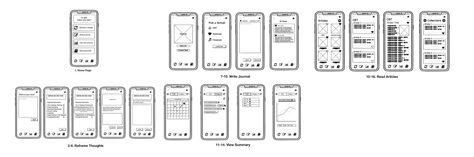
Based on the blurb on Quirk’s website, we designed four distinct features of the mobile interface:
Reframe negative thoughts using CBT techniques and cognitive distortions.
Write reflective journals.
Review summary for reframing exercise based on category of cognitive distortion or date.
Read CBT/mental health-related articles.
Our interface should address the following ethical questions: firstly, we should make sure that private information that users input pertaining to their identifiable information and personal emotions remain confidential, and make sure that consent is granted by the user before sharing the summary or detailed records with their therapists/family members. Secondly, we should be mindful of not to impinge the intellectual property of existing CBT books and resources when adapting CBT into an app format.
Sketches
After agreeing upon the theme of the interface, we started off sketching out the layout ideas. Then, we transformed all the hand-drawn sketches into Balsamiq and created a series of low-fidelity sketches.
High-Fi Prototype
To improve the affordance of the interface, we carefully selected icons for each distortion that are used consistently in the app. We also change the layout of the main page of the article section in our high-hi prototype, where we unified and made it consistent within the section.
We color-coded each section to improve visibility and allow users to easily identify where they are. The critique session helped us be more consistent on our color selections across the app. We ensured that we were always bolding letters when they were selected, and we also ensured all the next/save buttons were on the same side of the page and used the green color to enforce the distinction between saving and discard. We also improved the readability of our texts with better contrasting colors.

User Testing
Hypothesis
For this user testing, we aimed to see whether participants understand how they would use cognitive distortions to reframe their thoughts. We hypothesize that, if our interface was effective enough, users would understand that they shall identify the cognitive distortions first (and learn more about them if they need to), and then reframe an alternative thought trying to avoid the distortions.
Feedback and Results

Our metrics show that users successfully navigated through the four tasks because all users who saw an accurate display successfully completed the tasks (2/3 completion rate for all tasks) and the average time they spent on each task was reasonably short (~30-45 secs). However, based on their walk-through recordings and answers to our questions, it seems that they had a lot of trouble understanding the meanings and role of “cognitive distortions”, and thus we rejected our hypothesis. Our users frequently mentioned that the “cognitive distortion” page was confusing, that they were not sure whether they were supposed to check the boxes or the app would check them automatically, and that they also had trouble using the distortions when writing the reframed thought.
Findings
Results from User testing gave us some great insights into the thoughts and concerns of a typical user. In addition to the valuable quantitative results like time and errors, hearing their thought process and confusion as they went through this was very important and allowed us to reject our hypothesis. Also, during the process we learned that:
Users expected more from this version, for instance they thought they would be able to type in their thoughts in our app.
Testing with more functionality in this app would offer more constructive results.
While the feedbacks from three participants are informative, the test would be more beneficial with more testers.
Next Steps
Working on this project has taught me so much about planning and taking the appropriate steps to design, create, and iterate on an interface. I would love to take a step further and make the current version into a usable product.