
Mix + Play — A paint palette that teaches users fundamental color theory
When: October 2019- December 2019
What: Iterative Design, Prototyping, User Testing, Laser Cutting, Arduino
As a semester project for CS 1951C: Designing Humanity Centered Robots, we build a digitized, lap-top paint palette that teaches users fundamental color mixing theory through a matching game.
In collaboration with Cíntia Araujo, Jillian Cai, Talie Massachi, Jennifer Nino, and Snigdha Sinha
Project Statement
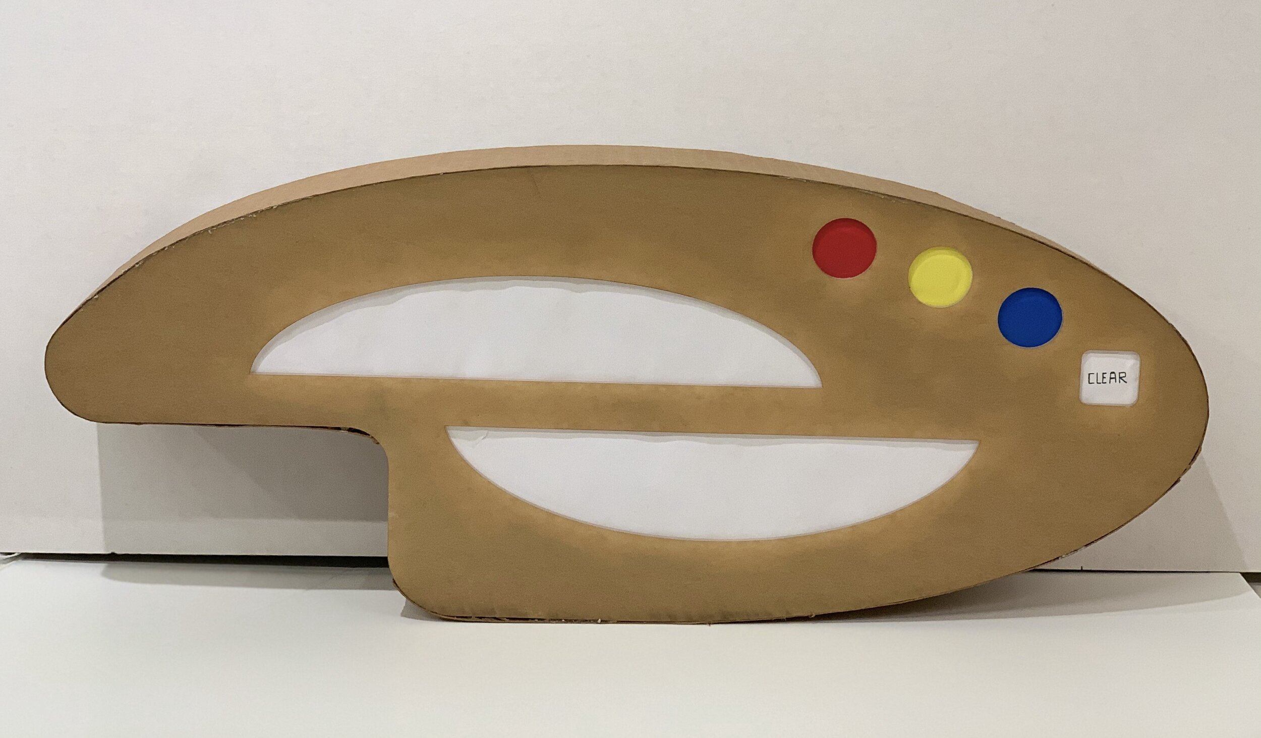
A digitized, lap-top paint palette that teaches users fundamental color mixing theory through a matching game. Users are presented with a target color and must mix their primary colors in order to proceed to the next round.
Initial ideas
Initially, we thought to create an immersive, meditative artistic experience. We thought to use colored blocks to control different musical pieces to play either separately or in tandem. For a visual aspect, we thought to create on-screen art on a connected computer based on the chosen and placed blocks.

Various designs for integrating a shape-to-audio feedback concept onto the physical laptop.
Refining
User testing

We recruited 5 friends who have no prior knowledge about the project and presented them with four versions of the design. We presented the following scenario and asked them to perform in the setting: If you are trying to mix color using the provided paint board, how are you going to do it, and what will you do?
Observations
Users are more likely to mix the color on the side of the plate when the mixing area is unclear (Version A). When commenting on the layout of paints and the water, 4/5 users reported they would prefer the design in version B. One user suggested that the water section can be moved to the left side of the paints. Also, 3/5 users reported the target color section was hard to see and suggested to change the shape of the screen since “there are too many circles on the plate already.” Moreover, 2/5 users expressed confusion toward the water icon and suggested the functionality should be more explicitly stated.
Insights
The layout, especially the color mixing section, needs to be intuitive or with clear instructions. The functionality of the water section needs to be more straight forward, either dissolve the color or remove all. The overall shape of the board is highly acceptable; thus, we should keep the current shape while making some modifications based on the feedback.
Final Direction
After a series of iterations and user testing, we decided to make the design of the palette more modern and sleek. To do this, we changed the outline of the palette to be a more geometric shape, and use white acrylic to build the “futuristic” sense of the palette. We make the shape of the color section into three identical circles to reinforce the modernistic design. Also, we added a “reset” button next to the colors and changed the shape into a square to distinguish its functionality from the other three buttons. Meanwhile, since we still want to maintain the ritual and beauty of a traditional oil painting palette, we keep the layout of the previous version and implement the fluid shape into the mixing section.

